SAE 50
LOGO DESIGN | COMPETITION | 2025
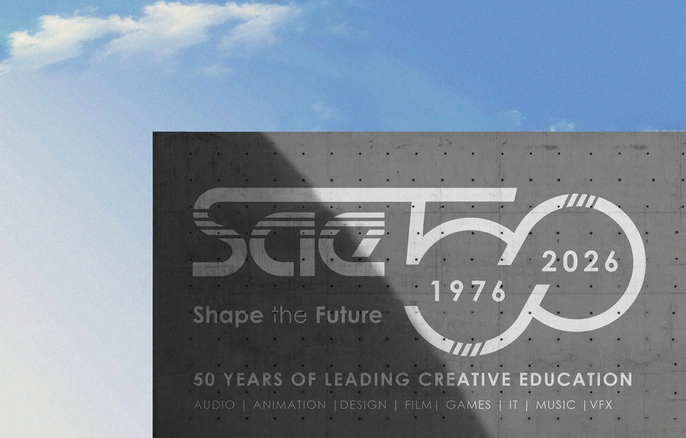
The SAE50: Shape the Future competition was an global design challenge for SAE students across the world to create special edition logo concept that builds upon SAE’s existing brand identity, celebrates 50 years of creative media education and looks forward to the future.
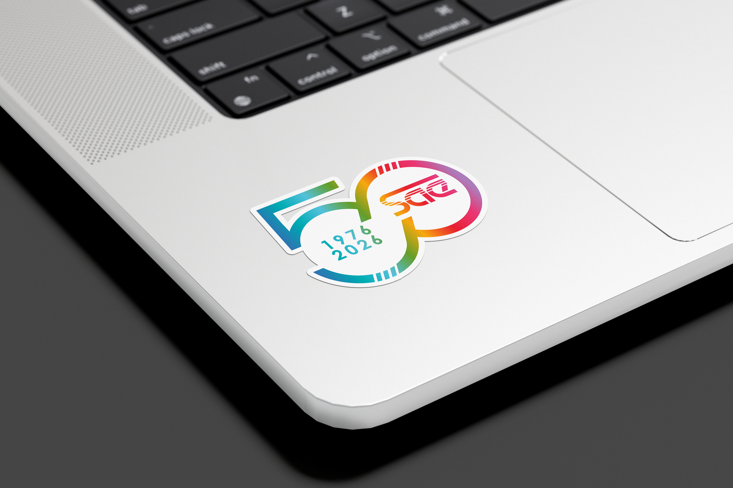
To call upon SAE’s heritage my design is inspired by two reels side by side, a common feature in many creative technologies - reel to reel audio converters, film reels, cassette tapes and even computer GPUs. The design speaks to the brands future through an enduring shape resemblant of an infinity sign, pointing upwards to the right and looking towards the future.
My logo concept won SAE’s design competition and I received my award in Cologne, Germany. A slightly adapted version of my logo is currently being used by SAE campuses globally for their anniversary year.

Challenge
Creating a logo concept that builds upon SAE’s current modern identity yet calls back to its history, and speaks to the future.
Design Intent
I wanted to create an anniversary logo that truly felt like it was part of the brands visual identity and not a separate element, to do this I used the same cutout motif and the bold white linework.
Insight
The best inspiration for this design didn’t come from looking at other 50th anniversary logos, but instead considering SAE’s history and finding a unique concept in real world references such as reel-to-reel audio converters, film reels and cassette tapes.
Outcome
With a few small tweaks this logo concept is now being used at SAE campuses globally. My concept was chosen for the way it ties into the brands current identity and its unique concept that encompasses the brand’s rich creative history.